A New System

Last week’s “What It Takes” post was about Systems. A new one was left out.
Black Irish Books turned to Vellum before the release of The Artist’s Journey by Steve and Running Down a Dream by Tim Grahl. (Thank you Joanna Penn for the recommendation.)
After uploading the manuscript for The Artist’s Journey, I realized that learning how to use Vellum (which was easy, by the way) wasn’t the first step.
I needed a style guide—and I’m not talking about the Chicago Manual of Style or Associated Press Stylebook here.
This is about those pieces specific to Black Irish Books.
Though many of Black Irish Books’ titles have a similar layout—more specifically those in the “Resistance” line—we don’t have a guide for a standard treatment.
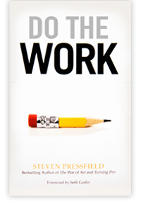
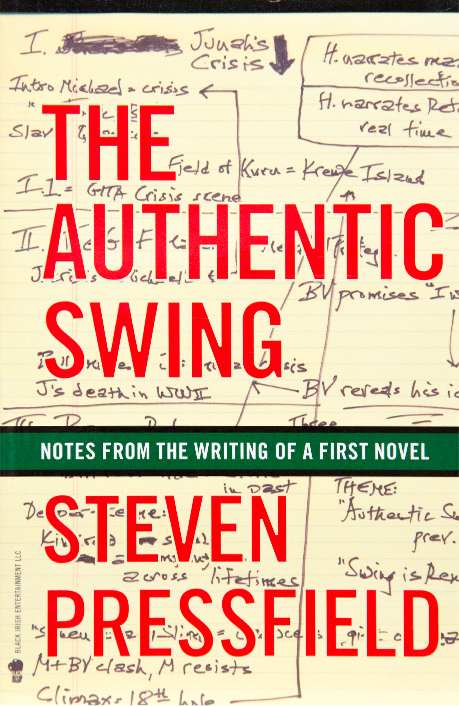
I went through The War of Art, Turning Pro, and The Authentic Swing, to determine the treatment for The Artist’s Journey and Running Down A Dream.
The following is some of what I found—and what I e-mailed Steve and Shawn after going through the three books.
Headers
It’s tempting to want to insert a natural line break for the longer headers, but I avoided doing so because the various screens will change in their length on their own. For example, if I view a long header on an iPad, it might all fit on one line, but if I view it on an iPhone it might be on two lines. For individuals that like to read large print, the headers might appear on three lines. For this reason, I avoided adding an extra line break, which might muck up the layout at different font sizes and screen sizes.Leading
I chose the loosest leading available in Vellum, since WOA, TP, and TAS all have extra space between the lines. If you think it is too much, I can tighten it.Half title page
1. I didn’t include your name on the half title page, although it is included in the manuscript provided. WOA and TP don’t have your name on this page, and most of the books on my shelf don’t have the author’s name on the half title page. The exception is TAS, which does have your name on the half title page.
2. In the manuscript, the half title page is included a second time, before Book One. WOA has it appearing a second time, too, but TP, TAS, and the majority of the books on my shelf don’t have it appearing twice. For this reason, I didn’t include it here.Also By
In the manuscript, TP, and WOA, the Also By page is included after the half title page and before the full title and CIP pages. In TAS, the Also By page is included after the CIP page.Also By
In the manuscript, WOA, and TAS you have Also By Steven Pressfield on one line and in caps. TP has Also By on one line and Steven Pressfield on the second line. I went with what is in the manuscript, WOA, and TAS. In the manuscript, WOA, and TAS, Also By Steven Pressfield is in a serif font, but in TP it is in a san serif font. I went with a serif font.
In WOA, TP, and TAS Fiction and Nonfiction are in a smaller san serif font, so I went with the smaller san serif font.CIP Page
WOA, TP, and TAS, use a smaller, bold, san serif font, so I used that format.Dedication
TAS has it in a script font, in italics. TP and WOA have “for” in an italicized script font and the names in a regular font. The manuscript has a regular font for everything. Vellum doesn’t allow for a script font, so I went with italics on everything.Epigraph
WOA and TP have em dashes before the names in quotes, so I included one here. The opening quote in TP is centered. I went with the left, justified alignment in the manuscript since the quote is longer than the TP quote.Introduction headers
WOA and TAS use a bold, san serif font, no underline. I went with this formatFirst page of each book within TAJ
Vellum doesn’t allow for manually adding larger font sizes. However, it does have a format for adding “parts” within a book, which is the format you see here. In its parts layout, the automated format comes with larger fonts. I can’t change the I to a One. It’s an automated feature that they use.Headers for each chapter
Headers in WOA and TP use all caps, a serif font, and are underlined. TAJ uses all caps, a san serif font, and no underline. I went with all caps and a serif font, with a line between the header and the text.Numbering
WOA has numbers listed with a half parenthesis after them: 1)
TP and the manuscript have numbers listed with a period after them: 1.
I went with TP and the manuscript and have periods listed after the numbers.In the manuscript, you have numbered items indented on pages 24, 75, 115, 134, 169 They are not indented on pages 19, 20, 21, 166, 167, 168 I went with indented throughout.
First letter of the first sentence of each page
TP and WOA use a drop cap that is the size of the first two lines. TAS uses a large cap that is the size of the line it is on, plus the equivalent of the empty line above it. I went with the WOA/TP version.Lists of songs/movies
These are all italicized and indented as they are in the manuscript.Quotes
In TAS, quotes were indented, justified, and italicized, with one exception. The story from Ander Crenshaw is not italicized. The quotes in WOA and TP aren’t italicized either. I chose to go with the indented and justified version, that is NOT italicized.
The above is far from being a complete style guide, but it was a place to start, and saved me time when I turned to Running Down A Dream. I didn’t have to flip through chapters to remember how an element was treated the first time it appeared. There was also the time saved on decision making. Might seem like a small thing, but in the course of laying out a book, the decisions needed add up in time.
I would never call myself a book designer, but Vellum put the power of designing in my hands. The style guide ruled Time and Continuity.
More on Vellum to come.


A few years ago I realized I was rethinking the design of each book and sending the spec to my formatter every time I published. Finally codified it all, both overall specs for all my books, and variations for each series. Posted them online, and now I send her a book and she does it, no back and forth and wheel redesigning.
Fiction authors always have a series bible with all the backstories and descriptions and whatnot, but it surprises me how many nonfiction authors never come up with a style guide beyond fussing about Oxford commas and superfluous apostrophes.
You wear a lot of hats. And wear them well.
I was an editor for a number of years with the publisher that does the “…For Dummies” series. They had a very detailed style guide. I especially enjoyed the section with guidance for “irreverent humor.”
Thanks Callie! I must confess I’m lost in the weeds on this one – much to learn!
Thanks Callie,I’ve just read Tim’s book – knocked out by it – and it’s great to see this example of systems being used to help life flow! I do so many things where I don’t have a system in place and keep reinventing the wheel. Will definitely learn from this, at last.
I have been on number international computing standards committees, which have to follow excruciatingly detailed formatting standards. We always had a paid technical editor to do the final pass, but with a committee spread all over the globe that had to approve everything, even small changes from the editor could take weeks to resolve. Therefore, it was in everyone’s interest to turn in perfect drafts. Most of the work was done by the mother of all Word templates. Understanding the template was a challenge, but when you did, you could produce perfectly formatted copy that looked exactly like the final product without much effort that would sail past the editor.
When I started writing books on computing, I was not surprised that my publisher insisted that I turn in manuscripts formatted with a Word template that looked exactly like the final book. For each book, I received a template from my developmental editor that was specified in my contract.
Nothing to it. I was already used to that mode of working.
When I started writing fiction, I put together a template for my books, which was much easier than templates for standards or non-fiction because fiction has comparatively few styles to contend with. Most of your style-sheet is embedded in the template. It makes producing a series of books with the same design easy.
Just another way of working