Rick Rubin’s Source

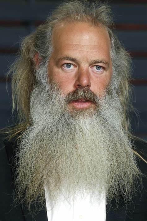
I was fortunate enough, a few months ago, to get a sneak look at an upcoming book called The Creative Act by Rick Rubin. Do you know who Rick is? He’s been called the Godfather of Hip-Hop. His recording studio, Shangri-La in Southern California, is and has been a mecca for everybody from the Beastie Boys to LL Cool J, to Run DMC, Public Enemy and many more.
Rick is a great believer in inspiration.
He calls it “Source.”
Rick’s book was a mind-blower for me because his view of Source is that it’s omnipresent. Like the trade winds, Source is a global, non-stop, open-all-night atmospheric phenomenon. Seeking Source is not like searching for a truffle in the woods, where you have to sniff out the one tiny, elusive germ of brilliance. Source is everywhere, Rick believes. And everyone is tapped into it.
Rick is famous for bringing a band into his Shangri-la studios to write and record an album. He doesn’t interfere or offer musical ideas. Instead he facilitates. His contribution, like that of a great movie director, is to create an environment of safety and freedom in which the artists can be as bold and crazy (or nasty) as they want to be. Take risks. Swing for the seats. Work in ways you’ve never tried before.
Trust Source.
Rick will appear in the studio like a barefoot Obi Wan-Kenobi and suggest to his guys that they write their next song backwards, or in another language, or in ten minutes with no revisions. Then he’ll leave and no one will know where he went or when he’s coming back.
If you ask Rick what his job is, he’ll say, “Serving Source.”
Rosanne Cash likes to say that a songwriter has to travel everywhere with a catcher’s mitt. Ideas for tunes and albums are constantly zinging through the atmosphere. “I’ve gotta catch ’em,” Rose says, “before they wind up with Lucinda Williams.”
Source.
The Cosmic Radio Station.
The Muse.
They’re real. And they’re sensational.
P.S. Today is our first beta-version of a new way of delivering these Writing Wednesday posts—directly, without an intervening “Click here to read the post” link. Whaddaya think? Like it? Hate it? Does the white-text-on-black-background work for you? How can we make it better? Thanks for any comments. Be brutally honest!
DO THE WORK
Steve shows you the predictable Resistance points that every writer hits in a work-in-progress and then shows you how to deal with each one of these sticking points. This book shows you how to keep going with your work.

THE AUTHENTIC SWING
A short book about the writing of a first novel: for Steve, The Legend of Bagger Vance. Having failed with three earlier attempts at novels, here's how Steve finally succeeded.

NOBODY WANTS TO READ YOUR SH*T
Steve shares his "lessons learned" from the trenches of the five different writing careers—advertising, screenwriting, fiction, nonfiction, and self-help. This is tradecraft. An MFA in Writing in 197 pages.

TURNING PRO
Amateurs have amateur habits. Pros have pro habits. When we turn pro, we give up the comfortable life but we find our power. Steve answers the question, "How do we overcome Resistance?"

Love the new email style!
I believe in the Muse too. Absolutely. Thank you for sharing this with the world. When I sit and work the idea flow from what appears to be nowhere and often things that have never occurred to me before.
Love it – how can you not love service to The Source?
thanks as always Steven
Many years ago, I was staring at a pretty girl (my future wife) across the room, she looked over at me and smiled and it seemed like a flash of light went off in my mind. I’ve had that happen other times in different situations… even awakening during the night with ideas that proved to be valuable for a new business endeavor or my WIP… do you suppose the Muse uses a bright light to get our attention? Maybe Steve’s insightful musings should feature flashes of light rather than darkness.
I like the new format. It stands out from the many other emails that land in my inbox.
Love the concept of the Source – “a global, non-stop, open-all-night atmospheric phenomenon”. Will be working harder to tune into it from now on.
Thanks for sharing.
Loved the idea of reading the whole post in the email, please keep it, thank you.
Ok, complete post in email, yes. Black background, trendy but no. It’s not enduring, IMO. You asked! I answered!
The new format was easier in terms of getting to the meat of story you tell.
New style email = 👍👍👍
Agree with this. White font on black background a bit tough to read. Love the content of the post on how Source / Muse / Intuition are all around us. The Cosmic Radio Station – that’s a great name / metaphor. What a super message all round: inspiring and thought-provoking. Like the written content right there in the email without linking to something else.
Excellent post. Only I am not a fan of white text on black background. It looks alien.
First time I didn’t put you in your Yahoo folder to read later. Love the white on black easy to read. Just great in every word image and design. Thanks!
I love both the direct post and the black background !!! Keep it! About the source, It’s true, it’s out there and we have to catch it to make it ours! Thanks, Steven, for sharing your thoughts ! It’s been very helpful for my process !!!
Master Steven,
The wisdom that your writing exudes doesn’t care about format.
Keep it coming.
I love it from a design perspective. And it’s nice to read the entire post in the email. I think you can trust us to link through to the site. 🙂
I’m not so much a fan from a readability perspective. I’ve read (and believe) that serif fonts are easier to read. And the white on black feels a bit “activated.”
Dig the experimentation, though.
The new email format is great, yes please keep it! The white font on black really pops and is very readable. Having the entire post available directly drew me in to reading it. Not sure if I would have clicked through otherwise. Suggest you trim the top and bottom of the Writing Wednesdays logo on the email to remove dead space and display more of the opening text to encourage reading on mobile devices. Great content, will be thinking about Source today…
“Suggest you trim the top and bottom of the Writing Wednesdays logo on the email to remove dead space and display more of the opening text to encourage reading on mobile devices. ”
Agreed.
I love the new format, but I would switch to the traditional black on white, or grey on white like the blog. It’s much better, IMHO.
Thank you for asking and more importantly, for searching new ways to serve us.
In British parlance, at the fairground, we call them dodgem cars (not sure if it is the same in the USA). But the point is, they’re a hilarious and thrilling ride in electrically-powered two-seaters that turn on a sixpence and collide and careen all over their metal-floored rink. The cars have thick, black, rubber bumpers that absorb the shock and bounce the car onwards towards the next – inevitable – collision. This funny game of vehicular Brownian Motion is energised by the pole at the rear of the dodgem that connects to the wire-ceiling that conducts the electrical current down to empower the car. Perhaps it is a long metaphor for how I tap-in to Source. I agree with Rick Rubin that it is an omnipresent force that is there for everyone to avail themselves of. The only obstacle to this free source of energy is knowing it is there. Next is owning the process of how to connect one’s ‘pole’. That obstacle in the gap between is what you – Steve – so adroitly label, ‘Resistance’. There are days we forget to erect our pole to contact with Source. There are others we refuse to do so in acts of self-sabotage. Some days it can even feel exhausting to conduct its expressive powers. But for many questers, they do not even know that it is there – and free. It’s like a well-kept secret… But that’s a whole other story 😉
Thanks again for the channel to Source, Steve. It is wonderful.
[Re the new look and constructive feedback. It required a double-take this morning. I’d like to send you a screenshot. Because – even though I am a lover of white text on black background (it is how I read on Kindle) – the email format felt jarring. Invaluable, nevertheless. ]
70 years ago we use to call them bumper cars. I loved them.
I like the white on black — very easy on the eyes.
I always look forward to your email. It’s my Wednesday morning gift. The new design of white print on a black background is a bit of a stain on my eyes, though. Reminds me of the time that I painted the living room turquoise. It was brave and bold and artsy . . . seemed like a good idea at the time, and I was relieved when later the same year, I replaced the color with a soft beige.
I love Rick’s reflection on Source and that we are wedded eternally to that Oneness. In these difficult times in which we live, creativity (tapping into Source) feels like salvation. Making something while so much is being torn down brings me hope. I’m going to read his book.
I love being able to read your message right there, in the email. The black background was wonderful to read on, and the message caught my attention strongly. Thank you for your work.
New format excellent…black text on white works better. Thank you Steven!
I agree! White on black causes eyestrain after a while.
Hey Steven, I prefer the new format, receiving your wisdom, friction-free! I also think the white text on black works well for your email.
Works for me.
The direct port works, the black background sets a tone (it’s not soft or encouraging) that is hard on the eyes and the mind. We come for the thoughts, definitely not for the blacks and the yellows
I love the new format with the insta-access-to-all. I love the white on black. It is easier for me to read and less harsh on my eyes. I like how the font is bigger and fatter too – that also makes it easier to read. Oh, and I loved this article!
Love the new format! Thank you!
The prior version was too cumbersome to click through to get the content and felt like the reader was being suckered in. Newsletter emails are old school done right, deliver a shareable punch that will keep a reader coming back for more.
Two thumbs up Steve!! Keep them coming please!👊🏻
New format is great – clean and easy to read. It looks well-designed without becoming “overwrought” with a simple layout. I love hearing about how other people commune with Source. Thank you for dropping the Rick Rubin.
One more great Roseanne Cash quote, “You have to show the Muse you are serious” Check out her interview with Krista Tippet on On Being (RIP)
Okay, this is hilarious – I just went back to read the transcript of the Roseanne Cash interview – and it was you, Steven, the whole time! You were with me before I even knew you! How interesting. Thank you serendipity.
I like having the content in the email. But that win is completely overshadowed by the white text on black background. It’s like being on a dark highway at night and facing an oncoming truck with its bright headlights in your face. And they refuse to cut back to their regular headlights. You are blinded. VERY irritating. It’s so much easier to read these comments than it is to read your post! Please get rid of white on black!
When it comes to writing Wednesday’s the medium is not the message. The message is the message. And, as always, it matters. But I like the new medium too.
I definitely like the ability to read the post in my email! The format is eye-catching, and I like the gritty old typewriter keys in the masthead. I’m also in total agreement about the concept of Source, and I look forward to reading Rubin’s book.
Thanks for putting out great content Steve!
Love all of it. Keep it coming.
I like the new way.
You asked. The content, as always, is great. I enjoy the insights and the conversation. The new format, not so much. Attractive from an aesthetic point of view perhaps, but not good for readability, for me at least. The font is too delicate so after a bit my eyes strain, and the contrast is too strong. The blue-on-black weblink is unreadable. IMHO.
Long time reader, first time commenter. The email content is a huge yes. It’s the way you used to do it! The black was really harsh on the mobile version (and the font looked awkwardly big), but it’s not so bad on my computer.
As for today’s content, I love Rick Rubin and cannot wait for this book!
In the email version I miss the serif font you use here. Thank you regardless!
It´s great. No other email like it.
Love it. I like the white print on black. Hey, let’s play catch with the universe; why not.
I love the post and the beta version of your new email.
Hate it. Sorry
YES TO DIRECT TO MY INBOX !!!
I love the new email. I’d suggest keeping for a bit and then switching once people have forgotten about it.
This is what jazz musicians Miles Davis and Herbie Hancock have done, invite different musicians and they would make it up as they go. Miles would go on stage with his players with no rehearsing.
Steve as far as I am concerned you have said it all. I do not really need another book on how all this stuff works. Over the years your words have slowly sunk into my brain. It’s like redoing the 12 steps of AA. Bill Wilson nailed it on the first draft. There has never been a revision in almost 100 years.
I hate the black and white, it hurts my eyes, it is too neon. It is just a little too hip. Then again what do I know, I’m just an old man. Old people don’t like change. Thanks for letting me share.
Much enticing to read and dig the anecdotal format to make the point. Large font easy on the eyes.
I like it. Content has always been fantastic. The format is visually appealing.
Keep up the great work and thank you for your mentorship.
Scott
Yep, I like the ‘straight to it’ email and I really like the white on black. Content has always been spot on. Thank you for that.
Much better to have email without the link! More streamlined! Looks great! I am digging the black with white text and photos! Outstanding!
The format is better. I do not like the reverse type however, but the content more than made up for it..
I liked the larger white font on black! It seems I read the email faster than usual!! And yes to direct email.
Thanks
Thanks for the terrific post and I’m looking forward to reading Rick’s book!
As for the new look, I have a hard time reading white on black. For what it’s worth, it seems to shortens my attention span!
Love the new format!
Two words struck me today.
TRUST SOURCE
I liked Rick’s idea of mixing things up. Lately, I’ve felt as if I’ve been sucked into a black hole. (No reference to today’s new format. I like it. I’d show up even if you chose a pink background with unicorns dancing along the borders.)
Trust source and push beyond the comfort zone. Looking forward to Rick’s book. Thanks, Steve. The way forward looks a bit clearer.
Another great post, Steve. Since I don’t subscribe to your email but go straight to your website, I have no comment about the email format other than to say that white on black don’t work well for readability–great visually but harder to read. Jackie, I loved the image of blunt, straight-shooter Steve having a pink background with unicorns. Hilarious!
Thanks Lin, trying to free the brain a bit.
The new look is amazing! I love it!!! Having the white text on the black background really makes the words “jump off the page” and into our subconscious. Totally Awesome, Mr. Pressfield👍🏻
This new layout is so much better! The white text on black is actually easier on my eyes because sometimes a white background can be glaring. And I like the ease and direct access to the topic, so keep this!
Love the direct to email, can read it on my phone. Didn’t often click through to the site. Much better. Thanks!!
I like the direct link approach. Although a redirect to your website was never an issue either. The content was excellent! The layout is another story. As a graphic and U/A designer for 30+ years, I’m not a fan of the white type on a black background. While some people can read this easily, it is not the most accessible to all eyes/ages. I prefer what you have on your website. Serif fonts are much easier to read than sans and black type on a white background is also more legible for most eyes. Can you tell I studied typography at Parsons for a year or more? I like the overall design of the email header. Although, yellow type is sometimes the hardest to read…and you don’t want your name to disappear…as it somewhat does in the current design. You asked for brutal honesty…
terrific, and great content in today’s post.
When I looked at the site this morning and saw over 42 comments, my first thought was today’s post was a retread, or I slept through an entire day. So I quickly went to the comments and saw they were all from this morning…odd I thought.
I’ll address the email first. This is the first time I’ve actually read an email about Writing Wednesdays for years. I simply go to the website every Wednesday morning, it is part of my Wednesday Devotional/grounding time. This new format obviously increased the number of comments–probably helped that Steve asked specifically for feedback about the new format.
About the increased comments–honestly I feel a bit more guarded today. Ironically, I was corresponding with a buddy via LinkedIn the other day–then we talked on the phone and agreed to meet for a run/coffee. He said, “I see you’re all over the comments on Pressfield’s blog–good stuff..”
I have never thought about how many people read this blog and the comments–it has always felt very intimate–maybe 20-50 people. I’m guessing now that I’m off by a few orders of magnitude…and this again gives me mixed feelings. I again begin to question what the hell I’ve written, and how many people must think I’m a ______, toss in any variable unflattering noun.
Long way to say, this new format is obviously better. Maybe Steve should be a bit more explicit in asking for feedback about the content in the future as well because I have found as much insight/guidance/hope/beauty in the comments as Steve’s original post–sometimes the comments exceed the post in depth and understanding.
I hope that this new format does increase the number of contributing readers, as I’ve found true friendships from this space. So I’ll try to be open and honest.
I love Duncan’s comment about bumper cars–and really like the term dodgem cars. Could be the difference in American football and football across the world. In the states, we’re not trying to dodge anyone (how I pronounced dodgem cars in my head)–we drive directly at another car. The entire idea is to smash into someone, surprised we didn’t name them ‘smashem cars’ in the States. Soccer is a less direct sport, football is smash mouth, direct, in your face.
As for Source, it has never been an easy connection for me. There are times when I have achieved it through practice, rarely, but mostly it is elusive and hits me when unexpected. When I’m busy doing something else–usually a physical but mindless task.
It is helpful to be reminded that it is omnipresent. I forget that often. Everyday. Every morning. I can be in touch with it, and lose it in a moment.
Read an interesting book about movement the other day. The author talks about all the science, hormones that are secreted during exercise–and while interesting, there is something very sterile about such a mechanistic approach to the feelings of joy and connection I get from exercise. I prefer the mystical explanation. In War of Art, some dude preface’s the book about how great it is–but he stops short of buying into Steve’s mystical explanation of Muses and Angels. He’s the guy who tried on every possible combination of his wardrobe, then sorted it all according to season, then did it all over again. Don’t relate to that at all either. I kinda feel sorry for those stuck in the material, the mechanistic view.
I’ve decided that all the science is more proof of the mystical. Source is real. Ineffable for sure. Mysterious. Elusive and yet omnipresent.
bsn
Great response, as always, Brian. I was startled by the number of comments too–they were at 70 when I showed up. I agree that all the science is more proof of the mystical–the whole is greater than the sum of its parts and science is only good for looking at the parts, individually. Like the body, when you cut something up in parts it dies. The mystery, the Source has to be accepted whole. A friend of mine and I talk a lot about the magic and mystery. It is so elusive. Sometimes it’s a little voice, sometimes it’s a swarm of gnats and sometimes it’s a thunderbolt. Never easy to ignore and it sometimes has to hit you over the head but it never seems to happen when you’re deliberately trying to make it happen. You have to open to it and let it come in. Connect to it like Duncan’s dodgem car pole but you are not really in control. The scariest part–no control. But what a great journey!
Hi Steve.
This new style works for me. I have my phone set to white text on black background anyway – it’s easier on the eyes (particularly at 3am when I’m woken by a crazy idea and have to write it down!) I wish everyone did it.
-Jane
Love that we get the post in email! The white text on black background is bold and eye catching. I personally would also like a link to the blog post (but that’s just me).
As always, this is a great post. I love hearing about the universal nature of the Muse and the way she works in people’s lives.
Love both the direct email and the new look.
Steve I love this white on black format in a short punchy complete message email. It’s brevity compensates those who don’t like the white on black for long reads.
I’ve never responded to an email like yours, and it’s weird that I’m doing so.
I suppose it’s reciprocated gratitude for the new format plus instantly vibing with the message. It was a great experience because it’s you giving to us without asking for anything in return (except a yay or nay).
Well done. You got me to “just do it”, so thanks.
Loved the post coming in an email and the black background and white text worked for me. Great way to get your posts.
Very inspiring message about Source, one I’m completely onboard with. Source is all around us like the air we breathe. When we don’t perceive Source, we’re simply not tuning in. Reminds me of the joke where the baby fish says to the papa fish, “People say water is all around us. What do you think? Should we believe it? “
I love your posts! But don’t like the black and white. Too heavy. Too contrasty.
Thank you for your shared wisdom.
I think it is aesthetically pleasing and provides easier access to your blog, Steve. Your wisdom deserves to be heard by the many struggling creators out there. I like it! I read it from my iPhone and from my desktop at work. Classy!
Rick Rubin? Creative genius. His Podcast, Broken Record, is stunning. I liked his interview with Andre 3000.
Have a beautiful week, all!
I like it.
I often mean to come back and click the link to read more and then get distracted … This email, I read all the way through – on my phone in the first opening. (Yaaaa)
The black background is not only aesthetically pleasing I am also aware it is more energy efficient all the way round. It takes more energy to show white or light screens. I currently have my laptop and phone on ‘dark mode for this very reason.
I like the direct message sent. White on black works for me.
Yes, I love the format and the thoughts about Source. As a facilitator in my professional life, I get what Rick does.
He creates the space for where the heart wants to be as a group phenomenon.
Been reading a bit of Rob Fitzpatrick’s “Write Useful Books.” Interested in how Steven or others here would succinctly describe “the promise” of “Put your Ass.”
ok time for a new computer then.
Love Rick. I think his best work was with Slayer!!!
I like the new delivery method, and appreciated learning about The Source.
This will cause endless debate. But here goes.
Drop out type or knockout type is a bad idea. Especially when there is so much of it. Harder to read by far.
David Ogilvy, the famous ad genius, opposed it mightily. And for good reason.
One source: Is reverse type harder to read?
Using reverse type dramatically reduces reader comprehension https://cuttingedgepr.com › Personal › Writing and layout
BTW, we have all gone to sans serif in this digital “arial” age, but serif may be easier to read:
Readability studies have actually found that serif typefaces are easier to read because the added strokes make each character more distinctive. More distinctive letters are easier for the eye to recognize quickly.Sep 23, 2020
Serif vs. Sans Serif Fonts: Is One Really Better Than the Other? https://designshack.net › Articles › Font Collections
Pick your poison. I’ll read it however your publish your blog. Thanks for experimenting.
Good.
Positive.
Inspiring.
TY.
Do not provide content in white type knocked out of a black background. It is unreadable as many studies of print magazine design have shown. Your words are so valuable that you would be wise to present them in the most readable format possible. Thank you.
Great post I loved it. I agree with Rick. Inspiration and thoughts are everywhere, but he adds the secret sauce. He facilitates, and that is not everywhere. Most of the time we have to do that ourselves. What a gift that he steps in and fills the role.
I like the idea of getting your articles immediately. I love it really, but I’m not so sure about the black background because for me the letters are not white they are yellow. Though, I can suggest an alternative idea. Gary Halbert used to run his email letter with black on a yellow background, as if it was a yellow legal pad. For some reason I always liked that format. It had the feel of a mentor sharing his notes with you. For what it’s worth.
I like having the post directly in the email, but find the white-on-black background hard on my eyes. Of course, the content is, as always, fabulous. Thanks!
I love getting the post directly and not having to click away. But I find the white type on the black background hard to read.
Love the new format, Steve. I’ve been digging into my Emerson lately and Source sounds very Transcendentalist . You explain it sap well and clear.
We’re all connected to the omnipresent energy which sends out a frequency (muse, angels, cosmic winds, etc.) that we can catch when our true self frequency resonates with that frequency. And Those resonations occur when we’re doing the work we’re meant to do. And the ideas emerge as intuitions, guiding us to be who we are and do what we’re meant to do.
LOVE IT❤️❤️❤️❤️❤️
A few comments about the new email format…
– About the blogpost-sent-in-full-to-inbox. It’s a tactic often used, in the newsletters world. But, if website traffic is important to you and your team, Steven, this new way of doing things will take traffic away (from your website). Cause there will be no need to come here, as a newsletter subscriber. Or no more effort to make, to have access to your writing wit + wisdom. All we’ll have to do, is sit and wait. Cause you + your wisdom will come to us, in full, in our inbox. An in-between option could be to create a teaser. By only sending your blogpost’s intro in an email – not just the title and a logline, like before. Then, have a “Read more” link below the dire-intro. Once clicked, the link open a new tab, to your blogpost’s page, and allow your subscriber to read – in full – the rest of the insight or anecdote you want to share with him or her, that week.
– About the white-text-on-black-background. Website designers love this. Cause of the dramatic / stylish look it gives to their work. But, from a practical standpoint, what designers forget is that black-text-on-white-background always reads better / easier. One question to ask then, is what’s the goal ? Looking great, or getting read ?
Steve, dropout (or knockout type) has been shown in research to affect readability and comprehension. David Ogilvy, a genius adman driven by research, was thoroughly against it. I worked at his agency for 18 years in NYC and his guidance remains with me many years later
Also, serif type is easier to read–again tons of research on this too. But the internet and arial typeface seems to have changed all that.
From a voice, tone, and manner standpoint, the black background does not match the warmth and caring of you Steve, nor your posts.
Pls, pls, I’m begging you, dump this approach.
OOPS! I double-responded. Didn’t mean to, I thought my first response had failed to go through. (My internet kept dropping yesterday.) As you can see, I’m adamant in disliking this new approach. Creative decisions should not be made by committee–a camel is a horse made by committee! Follow your vision wherever it leads. But dump the dropout type!
White on black works, entire message on email works, good to have link to the website on the email.
Not a fan of white-on-black text. I find it harder to read. But other than background and font color, I like the new direct format.
I liked the format. I read the whole thing before I even realized it.
I like the new format, but I never mind navigating to your site. I’m going to read it either way.
Thanks again for everything!
I like skipping Instagram and ending up at the “Source” of your information. I also could feel myself light up when reading your writing about the Source. I am a student of evidential mediumship and “Trust Source” is one the first thing we are taught!
Was anyone else’s reaction to this post that it might have been inspiring, had it been about something other than hip hop? Sure, different styles for different people and all… but I really don’t associate Beasties and Public Enemy with any kind of enlightened appreciation of the Source or Muse.
Sorry.
Querido Steve, da igual como lo escribas, sin blanco sobre negro, o bien a la inversa. Lo esencial para mí es poder traducirlo al español y tener la dicha de poder leerte cada miércoles. Mi ingles es algo básico y aún no logro interpretar la profundidad de tu pluma.
Gracias !!!!!!
I like the new email format, white on black. I can read the email from across the room. I lose the glare of the white background which interferes with my reading especially if the room is bright. For this person with vision issues, it works well. Thank you for providing meaty posts. They are short and robust.
I put Rick’s book on my Amazon list. It’s not yet available at the library.
I love the idea of source being available to us at all times.
It is the air we breathe.
White on black, Steven? Why?
I read your worthwhile posts for content.
When I want visuals, I’ll shop in Versace.
Frankly, this shift of focus smacks of distraction and receded confidence.
Just go write, please. And leave the reading to your readers. We love you or wouldn’t
be here.
Be well and prosper.
Sally
Wow, I’ve been listening to a few interviews with Rick Rubin, and I love his energy and deep wisdom on life and creativity. So look forward to reading the book!
I must say I am caught off guard by his appearance but then again he does look like a music man!
I’m a little bit late, but I always liked that story about Michael Jackson where he calls his manager or whatever in the middle of the night and starts telling him about one of his ideas he had, and the guy is like “Michael, can we do this in the morning?” or something like that, and MJ said “You don’t understand — if I don’t do this, Prince will do it first!”